Making printing easier in Silverlight 4
Well, what an exciting week! First Visual Studio 2010 is released, followed by Silverlight 4 yesterday! Consequently, I was inspired to post about something new! I’ve been spending some time looking at the new printing feature in Silverlight 4, and while on the surface it looks like a pretty simple and lower-level set of APIs, it’s possible to build rich frameworks on top of them for accomplishing common printing tasks. In this post, I’ll take a look at an attempt I made (and added to SLaB) at building such a higher-level API over printing that makes printing collections of data easier.
Specifically, I’ve been building a CollectionPrinter control – a control that paginates, previews, and prints collections in a template-driven, designer-friendly way. With this control, printing a collection can be entirely XAML-based and code-free!
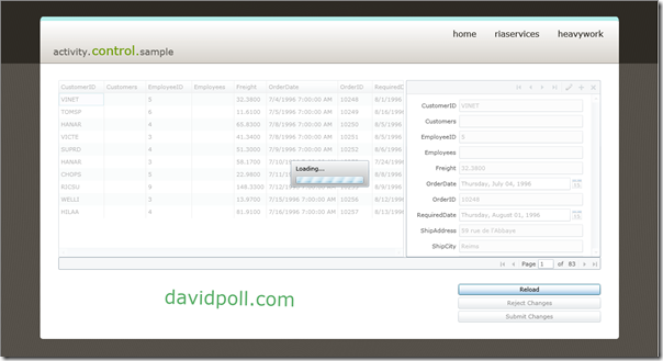
For example, the image below shows some sample data (courtesy of the Blend 4 RC) within a DataGrid being printed across multiple pages.
And you can see it in action by clicking here.
Of course, this is just an example of how one might want to build such a library, but it hopefully inspires some ideas you all might have around printing! I’d love to know what you think!
So, how does printing work?
The printing APIs in Silverlight 4 center around the PrintDocument class. SilverlightShow has a great article on the basics of using this class. Basically, the workflow for printing in Silverlight 4 is the following:
- Create a new PrintDocument
- Attach a handler to the PrintDocument.PrintPage event, which will be called for each page you choose to print
- Call PrintDocument.Print(), passing in a document name (which will appear in the print spooler, for example)
- The user is prompted to print
- In each PrintPage call:
- If you have content ready to print:
- Choose some UI to print to the page and set the PageVisual in the PrintPageEventArgs
- If there are more pages to print, set HasMorePages on PrintPageEventPargs to true
- If you’re not ready to print yet:
- Set PageVisual to null
- Set HasMorePages to true (you will be called back after a short delay for the content – up to 8 attempts will be made to print a page before printing fails)
- If you have content ready to print:
And that’s it! For each page, Silverlight will render a bitmap of the visuals you provided in PageVisual (just like with WriteableBitmap), then send this bitmap to the printer.
That all seems pretty straightforward… why do I need anything more?
Well, it is pretty straightforward. However, there’s a fair amount of work that you would have to do in order to create a coherently printed document:
- Pagination – in order to figure out which items to print on each page, you will need to add items to the page, searching for the item that would flow beyond the end of the page. This involves measuring/arranging pages and expanding templates, keeping track of the items you’ve printed so far, handling cases where items are too big for the page, and so on.
- Page layout – it’s very common to want headers/footers on your pages, which further complicates the pagination process.
- Page context – when printing a particular page, you often want some additional context, such as which items are on the page, the page number, the total number of pages (so that you can print “Page 1 / 10”, whether this is the first or last page, etc. This context must be calculated and tracked, and is difficult when the printing process is progressive as with the above API (e.g. how can I print the first page without first having rendered all of the pages, so that I know what the total page count will be?)
- Dealing with content not in the visual tree – often, you want to print UI directly from the visual tree, which is much easier. But when printing controls that are NOT in the visual tree, life gets much more complicated. As with WriteableBitmap, controls used as the PageVisual don’t get a full visual tree pass, meaning that events like FrameworkElement.Loaded don’t get raised. Some controls use such events to do initialization, such as the charting controls in the Silverlight Toolkit. In order to properly print arbitrary controls, it’s often helpful to actually place the control in the visual tree.
- Handling animations – many controls (again, such as the charting controls in the Silverlight Toolkit) have animations and transitions by default. For the charting controls, the data points being charted fade in by default. If you try to print this when the control is created, you’ll get a blank chart! One way to deal with this (if it’s the desired behavior) is to walk the visual tree, causing any running storyboard to SkipToFill.
- Print preview – while it’s not really possible to give a full preview of what a printed document will look like (because you can’t find out what the size/margins of the page will be before printing has started), one can approximate it and at least provide a hint as to what to expect when printing begins.
- Designability – Working with pages to print in Blend or Visual Studio’s designer can be somewhat difficult, especially if you need to write the code to handle the above cases.
As you can see, there are a number of complicating factors when doing sophisticated printing, but these can be abstracted away if the domain you’re given is specific enough. In this case, we’re printing a collection, and we can use the items in the collection as the units between which we can break up pages.
OK, cool, I think I get it. So, how does it work?
You can use the CollectionPrinter much like an ItemsControl. It’s fundamentally DataTemplate-driven. It has an ItemsSource and an ItemTemplate, but instead, you can specify a BodyTemplate (which, by default, is an ItemsControl :)). For headers, footers, and such, you can specify additional DataTemplates.
All of the DataTemplates are bound to a “CollectionPrintContext” which contains the following pieces of information:
- CurrentItems – the set of items being printed on this page (this collection will be built up dynamically during printing/previewing)
- CurrentPage/CurrentPageIndex – the page number (1- or 0-based) being printed
- First/Last items (so that you can print “Items 1-10” or “Aa – Aardvark” on each page):
- FirstItem/FirstItemIndex/FirstItemValue – the first item being printed on the page (1-based index, 0-based index, or actual value, respectively)
- LastItem/LastItemIndex/LastItemValue – the last item being printed on the page (1-based index, 0-based index, or actual value, respectively)
- PageCount – the total number of pages to print (note: this is a nullable int value and may not be provided if there isn’t time to finish pre-rendering all pages before the PrintPage callback limit is reached)
- PageMargins – the margins of the page being printed
- PrintableArea – the size of the space in which the page can be printed
The hope is that with these pieces of information to bind to, you can print rich pages for your users. The rest is just creative use of bindings :)
To kick off printing, either call the Print() method on the CollectionPrinter or bind a button to the PrintCommand property on the CollectionPrinter for completely code-free printing!
The CollectionPrinter will attempt to address all of the issues above, spawning invisible popups to ensure that the UI actually has a moment to be in the visual tree, walking the visual tree to skip animations to fill, and most importantly paginating all of the items in the ItemsSource.
Let’s see it in action!
Using an ItemTemplate
The most basic case for printing with the CollectionPrinter is to use an ItemTemplate, just as you would with an ItemsControl. The CollectionPrinter will happily handle cases where items are irregularly sized, so be as rich as you’d like!
For example:
The XAML style for this CollectionPrinter is as follows:
<Style x:Key="PrintStyle"
        TargetType="SLaB:CollectionPrinter">
    <Setter Property="ItemTemplate">
        <Setter.Value>
            <DataTemplate>
                <Border BorderThickness="1"
                        BorderBrush="Gray">
                    <Grid>
                        <Grid.Resources>
                            <Style TargetType="TextBlock">
                                <Setter Property="FontSize"
                                        Value="12" />
                            </Style>
                        </Grid.Resources>
                        <Grid.ColumnDefinitions>
                            <ColumnDefinition />
                            <ColumnDefinition />
                        </Grid.ColumnDefinitions>
                        <StackPanel Grid.Column="0"
                                    Margin="10">
                            <Image Source="{Binding Photo}"
                                   Height="{Binding Age}"
                                   Width="{Binding Age}"
                                   HorizontalAlignment="Left" />
                            <TextBlock Text="{Binding Name, StringFormat='Name: {0}'}" />
                            <TextBlock Text="{Binding Age, StringFormat='Age: {0}'}" />
                            <TextBlock Text="{Binding Address, StringFormat='Address: {0}'}"
                                       TextWrapping="Wrap" />
                        </StackPanel>
                        <toolkit:Chart Grid.Column="1"
                                       Title="{Binding Name}">
                            <toolkit:ScatterSeries DependentValuePath="X"
                                                   IndependentValuePath="Y"
                                                   Title="Values"
                                                   ItemsSource="{Binding Values}" />
                        </toolkit:Chart>
                    </Grid>
                </Border>
            </DataTemplate>
        </Setter.Value>
    </Setter>
    <Setter Property="HeaderTemplate">
        <Setter.Value>
            <DataTemplate> ... </DataTemplate>
        </Setter.Value>
    </Setter>
    <Setter Property="FooterTemplate">
        <Setter.Value>
            <DataTemplate> ... </DataTemplate>
        </Setter.Value>
    </Setter>
</Style>
<SLaB:CollectionPrinter x:Name="printer"
                        Style="{StaticResource PrintStyle}" />
All it takes to print based on this style is setting the ItemsSource (in this case to some Blend sample data) and binding a button to the PrintCommand on the control. In my header and footer templates, I have controls that are bound to the CollectionPrintContext, and whose visibilities are determined by binding to things like IsFirstPage (see the source included in the SLaB download for more details).
Changing the BodyTemplate (and printing a DataGrid)
Now, that’s all wonderful if all I want to do is print something that looks like an ItemsControl. But what can we do if we want to print a DataGrid (with column headers, etc.)? Well, the CollectionPrinter doesn’t depend on being given an ItemsControl at any point. Instead, it determines pagination based upon the DesiredSize of its content after measuring/arranging. As a result, anything that grows as its bound content is changed will work with the CollectionPrinter. You can easily print a DataGrid in this way, as I’ve done below:
 And the XAML barely changes from what you see above. In this case, instead of using an ItemTemplate, I set a BodyTemplate, which is a DataGrid (with vertical scrolling disabled) with a variety of columns. In this case, I’ll specify the DataTemplates inline:
<SLaB:CollectionPrinter xmlns:sdk="http://schemas.microsoft.com/winfx/2006/xaml/presentation/sdk"
                        xmlns:chartingToolkit="clr-namespace:System.Windows.Controls.DataVisualization.Charting;assembly=System.Windows.Controls.DataVisualization.Toolkit"
                        xmlns="http://schemas.microsoft.com/winfx/2006/xaml/presentation"
                        xmlns:x="http://schemas.microsoft.com/winfx/2006/xaml"
                        xmlns:SLaB="http://www.davidpoll.com/SLaB">
    <SLaB:CollectionPrinter.HeaderTemplate>
        <DataTemplate> ... </DataTemplate>
    </SLaB:CollectionPrinter.HeaderTemplate>
    <SLaB:CollectionPrinter.FooterTemplate>
        <DataTemplate> ... </DataTemplate>
    </SLaB:CollectionPrinter.FooterTemplate>
    <SLaB:CollectionPrinter.BodyTemplate>
        <DataTemplate>
            <sdk:DataGrid ItemsSource="{Binding CurrentItems}"
                          AutoGenerateColumns="False"
                          VerticalScrollBarVisibility="Disabled">
                <sdk:DataGrid.Columns>
                    <sdk:DataGridTextColumn Binding="{Binding Name}"
                                            Header="Name" />
                    <sdk:DataGridTextColumn Binding="{Binding Address}"
                                            Header="Address" />
                    <sdk:DataGridTextColumn Binding="{Binding Age}"
                                            Header="Age" />
                    <sdk:DataGridTemplateColumn Header="Image"
                                                IsReadOnly="True">
                        <sdk:DataGridTemplateColumn.CellTemplate>
                            <DataTemplate>
                                <Image Source="{Binding Photo}"
                                       Height="50"
                                       Width="50" />
                            </DataTemplate>
                        </sdk:DataGridTemplateColumn.CellTemplate>
                    </sdk:DataGridTemplateColumn>
                    <sdk:DataGridTemplateColumn Header="Values"
                                                Width="*"
                                                IsReadOnly="True">
                        <sdk:DataGridTemplateColumn.CellTemplate>
                            <DataTemplate>
                                <chartingToolkit:Chart Title="{Binding Name}">
                                    <chartingToolkit:ScatterSeries DependentValuePath="X"
                                                                   IndependentValuePath="Y"
                                                                   Title="Values"
                                                                   ItemsSource="{Binding Values}" />
                                </chartingToolkit:Chart>
                            </DataTemplate>
                        </sdk:DataGridTemplateColumn.CellTemplate>
                    </sdk:DataGridTemplateColumn>
                </sdk:DataGrid.Columns>
            </sdk:DataGrid>
        </DataTemplate>
    </SLaB:CollectionPrinter.BodyTemplate>
</SLaB:CollectionPrinter>
Explicitly providing individual pages
You can also use the CollectionPrinter for printing multiple pages explicitly (automatically dealing with all of the PrintPage callbacks, running animations, etc.) by providing a series of DataTemplates (one for each page) as the ItemsSource, changing the BodyTemplate to a ContentControl, and setting the maximum number of items to print per page to 1. For example:
And, of course, the corresponding XAML:
<SLaB:ObservableObjectCollection x:Key="Pages">
    <DataTemplate>
        <StackPanel>
            <TextBlock FontWeight="Bold"
                        FontSize="20">Lorem Ipsum</TextBlock>
            <TextBlock TextWrapping="Wrap"
                        Margin="10"
                        xml:space="preserve">Lorem ipsum dolor sit amet, consectetur adipiscing elit. Integer ultrices cursus tortor ac egestas. Pellentesque semper lobortis enim, vel imperdiet dolor vehicula ac. Suspendisse auctor tempus molestie. Cras pulvinar sagittis libero, vel pretium ipsum consectetur sit amet. Vestibulum ante ipsum primis in faucibus orci luctus et ultrices posuere cubilia Curae; Vestibulum feugiat nunc eget ante euismod ac facilisis velit aliquet. Vestibulum eget nulla magna, eget scelerisque ligula. Cras nec nisi faucibus leo fermentum euismod eu vel lacus. Etiam lacus massa, pulvinar id tempor eget, varius at lorem. Praesent venenatis nisi ac ipsum facilisis at suscipit magna sollicitudin. Phasellus placerat imperdiet hendrerit. Nulla ac risus velit. Sed orci lorem, imperdiet vel ultrices et, viverra ut leo. Mauris feugiat, diam eget mollis tempus, est leo pellentesque risus, vitae lacinia ante felis hendrerit elit.

Suspendisse potenti. Donec dui justo, ultrices quis condimentum vel, bibendum vel nisi. Pellentesque suscipit fermentum dui vel sodales. Nulla vitae tortor vel orci posuere vestibulum. Curabitur non lacus quam. Nulla sit amet tempor libero. Integer dictum lectus ut sem adipiscing vitae fringilla felis accumsan. Mauris ut risus felis, ut pulvinar quam. Class aptent taciti sociosqu ad litora torquent per conubia nostra, per inceptos himenaeos. Vestibulum ante ipsum primis in faucibus orci luctus et ultrices posuere cubilia Curae; Integer fermentum, turpis sit amet tincidunt fermentum, metus mauris bibendum nisi, nec tincidunt purus enim nec nisi. Sed faucibus congue ultricies. Maecenas sed lorem id sem ornare imperdiet ut vitae libero. Curabitur mi diam, ornare sit amet dignissim eu, imperdiet sed nibh. Donec ultrices libero sed ipsum sollicitudin in dapibus elit rutrum. Nulla egestas tempus est, nec semper lacus sodales vel. Quisque consectetur turpis nunc, eu pretium felis. Etiam non adipiscing elit.

Cras sit amet volutpat metus. Nunc eu augue eu urna placerat adipiscing in vel lacus. Etiam auctor orci nec dui adipiscing non viverra nisl gravida. In lacinia venenatis lobortis. Vestibulum dignissim, dolor ut feugiat ultricies, eros odio adipiscing augue, quis congue turpis augue quis mauris. Aliquam at ligula sem. Aenean eget arcu ac odio eleifend convallis. Aenean eu tellus ac eros placerat aliquam. Nam consectetur neque sed massa accumsan mollis. Pellentesque in mi erat, eget tristique elit. Praesent mattis magna sed est placerat bibendum venenatis nulla facilisis. Duis nec mollis nisi. Vestibulum et eros vitae felis vestibulum scelerisque. Donec venenatis, nulla vel rutrum tempus, purus nulla feugiat felis, eu semper diam nibh tincidunt metus.

Praesent venenatis aliquet vulputate. In suscipit, nulla ut pulvinar ullamcorper, diam ligula sagittis enim, fermentum tempus nunc neque sed nisi. Vivamus aliquam rutrum scelerisque. Phasellus suscipit, quam sed suscipit pretium, massa nunc elementum lectus, et adipiscing arcu turpis sed dolor. Suspendisse potenti. Proin nisl mauris, sodales tincidunt ultricies sed, placerat quis enim. Nulla elementum nunc vel sapien venenatis venenatis vel eu ligula. Sed vitae erat ante. Etiam nec sapien nec sapien sagittis hendrerit. Duis at odio dolor. Sed condimentum euismod felis, ut congue dolor luctus quis. Duis non tellus enim. Quisque quis odio erat. Nulla nulla mi, dapibus ut euismod ut, adipiscing nec lacus. Aliquam faucibus dui at est accumsan ut laoreet erat pellentesque. Nullam id malesuada tellus. Donec et ligula tincidunt metus rutrum pretium. Vestibulum ante ipsum primis in faucibus orci luctus et ultrices posuere cubilia Curae;

Sed lacinia dignissim scelerisque. Duis pharetra elit et nisl euismod viverra. Nam semper, purus ut luctus tincidunt, eros nisi aliquam nunc, non semper lorem enim sit amet augue. Vestibulum adipiscing tortor a magna tristique fringilla. Etiam porta volutpat odio, eu posuere velit mollis non. Mauris ut arcu quis lectus dapibus condimentum. Pellentesque non bibendum nisi. In hac habitasse platea dictumst. Maecenas laoreet lorem ut sem pellentesque id facilisis nibh pulvinar. Vivamus tempus erat placerat diam condimentum ac bibendum felis egestas. Quisque mollis hendrerit risus, ac euismod metus dapibus nec. Pellentesque habitant morbi tristique senectus et netus et malesuada fames ac turpis egestas. Phasellus quis ipsum euismod dolor pharetra viverra eget a augue. Morbi lorem enim, porta ut congue quis, pretium et enim.
            </TextBlock>
        </StackPanel>
    </DataTemplate>
    <DataTemplate>
        <Grid>
            <Grid.RowDefinitions>
                <RowDefinition Height="Auto" />
                <RowDefinition Height="*" />
            </Grid.RowDefinitions>
            <TextBlock FontWeight="Bold"
                        FontSize="20">Lorem Ipsum</TextBlock>
            <Image Grid.Row="1"
                    HorizontalAlignment="Center"
                    VerticalAlignment="Center"
                    Source="/ScratchPrintingProject;component/SLaB Logo.png" />
        </Grid>
    </DataTemplate>
</SLaB:ObservableObjectCollection>
<Style x:Key="PrintStyle"
        TargetType="SLaB:CollectionPrinter">
    <Setter Property="MaximumItemsPerPage"
            Value="1" />
    <Setter Property="BodyTemplate">
        <Setter.Value>
            <DataTemplate>
                <ContentControl ContentTemplate="{Binding CurrentItems[0]}"
                                HorizontalContentAlignment="Stretch"
                                VerticalContentAlignment="Stretch" />
            </DataTemplate>
        </Setter.Value>
    </Setter>
    <Setter Property="HeaderTemplate">
        <Setter.Value>
            <DataTemplate> ... </DataTemplate>
        </Setter.Value>
    </Setter>
</Style>
<SLaB:CollectionPrinter x:Name="printer"
                        ItemsSource="{StaticResource Pages}"
                        Style="{StaticResource PrintStyle}" />
Above, I have two pages: one with a bunch of text, and one with a large image on it. I still get all of the context for my headers/footers, and can use this as a way to get the benefits of using the CollectionPrinter without being locked into an ItemsControl-like behavior.
Headers and Footers
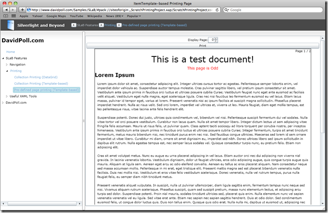
Creating Headers and Footers for each page is also really easy with the CollectionPrinter – just specify a HeaderTemplate or a FooterTemplate. These DataTemplates are bound to the CollectionPrintContext, which you can use to generate your header and footer info. I use some ValueConverters (in one of the SLaB libraries, if you’d like to reuse them) to conditionalize Visibility of a title for a document to the first page, and to change colors/text for the other pages. I also use the FirstItemValue/LastItemValue to provide a “Aa – Aardvark” (like you’d find in a dictionary) footer on each page.
For example, the sample pages above use the following XAML for their header/footers:
<SLaB:CollectionPrinter.HeaderTemplate>
    <DataTemplate>
        <StackPanel HorizontalAlignment="Stretch">
            <StackPanel.Resources>
                <SLaB:BoolConverter x:Key="BoolConverter" />
            </StackPanel.Resources>
            <StackPanel HorizontalAlignment="Right"
                        Orientation="Horizontal">
                <TextBlock Text="{Binding CurrentPage, StringFormat='{}Page {0} '}" />
                <TextBlock Text="{Binding PageCount, StringFormat='{}/ {0}'}" />
            </StackPanel>
            <TextBlock HorizontalAlignment="Center"
                        Visibility="{Binding IsFirstPage, Converter={StaticResource BoolConverter}}"
                        FontSize="32">This is a test document!</TextBlock>
            <TextBlock HorizontalAlignment="Center"
                        Visibility="{Binding IsLastPage, Converter={StaticResource BoolConverter}}"
                        FontSize="16">This is the last page!</TextBlock>
            <TextBlock HorizontalAlignment="Center"
                        FontSize="14">
                <TextBlock.Foreground>
                    <Binding Path="CurrentPage">
                        <Binding.Converter>
                            <SLaB:EvenOddConverter>
                                <SLaB:EvenOddConverter.Even>
                                    <SolidColorBrush Color="Blue" />
                                </SLaB:EvenOddConverter.Even>
                                <SLaB:EvenOddConverter.Odd>
                                    <SolidColorBrush Color="Red" />
                                </SLaB:EvenOddConverter.Odd>
                            </SLaB:EvenOddConverter>
                        </Binding.Converter>
                    </Binding>
                </TextBlock.Foreground>
                <TextBlock.Text>
                    <Binding Path="CurrentPage"
                                StringFormat="This page is {0}">
                        <Binding.Converter>
                            <SLaB:EvenOddConverter>
                                <SLaB:EvenOddConverter.Even>
                                    Even
                                </SLaB:EvenOddConverter.Even>
                                <SLaB:EvenOddConverter.Odd>
                                    Odd
                                </SLaB:EvenOddConverter.Odd>
                            </SLaB:EvenOddConverter>
                        </Binding.Converter>
                    </Binding>
                </TextBlock.Text>
            </TextBlock>
        </StackPanel>
    </DataTemplate>
</SLaB:CollectionPrinter.HeaderTemplate>
<SLaB:CollectionPrinter.FooterTemplate>
    <DataTemplate>
        <StackPanel HorizontalAlignment="Center"
                    Orientation="Horizontal">
            <TextBlock Text="{Binding FirstItemValue.Name}" />
            <TextBlock Text=" - " />
            <TextBlock Text="{Binding LastItemValue.Name}" />
        </StackPanel>
    </DataTemplate>
</SLaB:CollectionPrinter.FooterTemplate>
Nifty, isn’t it? :)
That’s a lot of XAML! Do I have to write all of that by hand?
Of course not! In fact, with the CollectionPrinter, Blend gives you a nice little print preview (especially if you use it as the root of a XAML file) and lets you modify the various templates directly in Blend, inline with the rest of the page! You can adjust the “CurrentPageIndex” property to preview your CollectionPrinter configuration in the designer.
To accomplish this in Blend:
- Select a CollectionPrinter on the designer (either making it the root of a XAML document or selecting it in your existing XAML)
- Right-click the CollectionPrinter in the Objects and Timeline Window
- Choose “Edit Additional Templates”
- Choose a template to edit, and either edit a copy, edit the current template, or create an empty template.
- Edit away! Drag/drop your printed content!
So, what’s it all add up to?
It’s very common for business applications to want to print the data they’ve collected, and it’s not hard to see how that might be a chore. Silverlight 4 introduced the printing feature, which allows printing at a very low level, but it also allows a huge amount of freedom in determining exactly what gets rendered to the page. This freedom can make simple printing tasks a chore. My hope is that the CollectionPrinter helps demonstrate how one might build a general-purpose (but more constrained than the built-in API) printing API. I’d love to know what you think. For me, it was primarily an experiment to see how close I could come to making printing large data sets easy and designable. Does this come close to what you’d hope for? What would your ideal be?
Sweet! Can I try it?!
I’m glad you’re so enthused! I’m tempted to say no, but wouldn’t torture you like that :). You can give it a shot using my latest build of Silverlight and Beyond.
You can see the live demos here (Requires Silverlight 4):
If you’d like to save time printing (yeah, it takes a while – it renders some pretty large bitmaps!), you can see some sample output files below. Notice that the “Long” documents don’t have the total page count displayed, since it took longer to pre-render all of the pages than the PrintPage retry limit would permit:
- ItemTemplate-based Document – Short (PDF 7.5 MB), Long (PDF 37.7 MB)
- DataGrid-based Document – Short (PDF 7.9 MB), Long (PDF 37.0 MB)
- Individual page-based Document – Download (PDF 5.8 MB)
Finally, some source code for you:
SLaB v0.5 (includes source, a sample app, some tests, and binaries)
- For the latest version, please check out SLaB on my Downloads and Samples page.
- The v0.5 download of SLaB includes the following changes:
- Updated for SL4 RTW
- Added CollectionPrinter for printing collections of items
- Fixed a bug with Sitemap-based controls that caused some pack Uris to be evaluated as "equivalent" (and thus highlighted) even when they were not
- Added EvenOddConverter that allows you to select an arbitrary value based on whether the input value was even or odd
- Other minor bugfixes
Enjoy, and let me know if you have any questions, thoughts, or ideas!
Remember, SLaB is just a collection of the samples and experimental components I’ve been putting together so that they’re all in one place. I can’t make any guarantees about maintaining them, fixing bugs, not making breaking changes, etc., but you’re more than welcome to try them out, use them, and let them inspire your development (or show you what not to do if you really dislike something I’m doing!) :).
P.S. Do you know you talk to yourself in these blog posts?
Yes, yes I do, Mr. “Person behind the headers of the sections in my blog posts who is actually me.”
UPDATE 4/25/2010: Thanks for the feedback in the comments on this post. I have updated the CollectionPrinter to help with the DataGrid AutoGenerateColumns issue reported by “mb”. It may still have problems if the ItemsSource is not an IEnumerable<T> (but rather just a plain IEnumerable), but I think this should cover the 90% case.
You can download the newest bits here. I also added a nice little utility method to SLaB that helps get a MethodInfo using a compiled Expression (using the LINQ expression libraries). Please let me know if you encounter other issues!
